
- From left to right, top to bottom - The title of the film, Setting/location, Costumes and props,
Camerawork and editing, Title font and style, Story and how the opening sets it up,
Genre and how the opening suggests
it, how characters are
introduced, Special effects
The title of our film is Necro5is. The ideologies
behind this was that we wanted to find a synonym of the word death but also be
able to incorporate a number (5) into the name itself, much in the same way as
the movie Se7en does. This is because the number five is a key topic in our
film, with their being five friends. However, this also acts as somewhat of a
red-herring, as we actually have six characters, the last of which is revealed
at the end of the two-minute opening. Our film title uses the common movie
convention of having a title that, whilst fitting the movie in one way or
another, does not reveal too much about the overarching story. Despite this, we
also challenged the common conventions by adding the number into the name,
something that has only been done by the vast minority of films. This blending
of common and rare conventions makes the final product of the film stand out to
not only our target audience but also a wider audience coaxed in by the
ambiguity of the title.
 |
| Title from Se7en, which we took inspiration from |
The setting for our film is the forest at Thorndon
Country Park. This is a very conventional location for the horror genre, due to
its connotations of darkness and isolation and also its direct linking to
common phobias like Nyctophobia (fear of the dark) and Mazeophobia (fear of
being lost). A lot of movies use this setting for good effect, such as Camp
Crystal Lake from any of the Friday the 13th films, Deadite Forest
from The Evil Dead and Black Hills Forest from The Blair Witch Project.
The woodlands in these films present the ideas of the unknown, each of which
containing mysteries that need to be discovered. As we took our inspiration
from The Breakfast Club, but produced a movie from the horror genre, we decided
to take these character archetypes out of the setting of that film and place it
in the setting from a film with the same kind of casting, like The Blair Witch
Project. Whilst doing this, the characters are the main focus as opposed to cheap
scares – which challenges the norm for Horror flicks of this category.
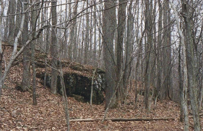 |
| Black Hills Forest, setting of The Blair Witch Project, which was our inspiration for Thorndon Country Park |
The costumes that we used in our opening two
minutes follow the conventions of this genre of movie very closely. Each of
them link to the character archetype that is being used for our two minutes;
the Basket-Case wears black clothing with ripped jeans, the Princess wears a
sexually revealing dress, the Jock wears sport related clothing (like a
baseball cap), the Brain is dressed smartly and finally the Criminal wears a
coat with the hood up. An easy comparison to draw here is to our main
inspiration, The Breakfast Club; which we followed but also adapted to fit our
modern day story. Another comparison is between Basket-Case and the main
character from the remake of Evil Dead, as both of them wear clothes often
associated with ‘emo’ or ‘gothic’ individuals. Another aspect which we chose
not to challenge the conventions of was props. For our props we used
stereotypical items that could be found in everyday life and our audience could
relate to having; i.e. a butterfly knife, some prescription pills and school
revision guides. We also included a mobile telephone as a prop that shows that
our movie is set in a very modern time- as the phone shown is a recent release.
These types of props can also be seen in modern day horror movies like The
Forest, where the main character is often seen holding a mobile phone.
 |
| Main character from Evil Dead, providing a comparison to Basket-Case |
Every cinematic media text uses a wide variety of
camera angles, movement and editing techniques in order to add variety to their
product- but camerawork can also convey hidden messages (like emotions) from
what is happening on screen. For our two-minute opening, we used a multitude of
different techniques in order to convey our story through camerawork. For
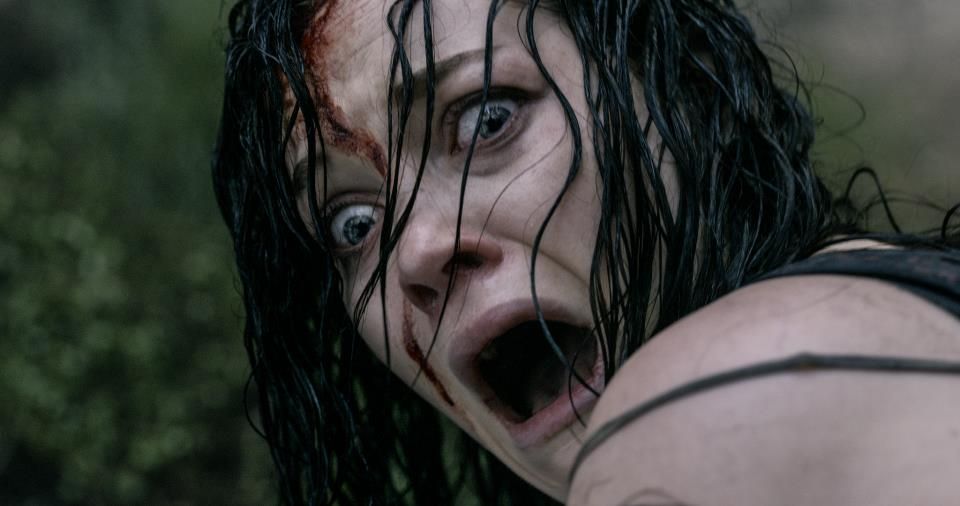
example, we used a close-up of a character's face at the end in order to show
the emotion of terror, much akin to the close-up shot that is used in the movie
psycho. We also used a close-up of Basket-Case’s face when she is shouting, to
show her anger and how she is distraught about the situation. We used some
extreme long shots in order to establish the woodland scenes, at one point
using a panning shot to show a path with the light shining between the trees.
Another key shot that we took was the birds-eye-view from the drone. This shot
created an enigmatic quality, showing that our setting could be anywhere in the
world as there was no key iconography (like recognisable buildings). It also
showed the vastness of our setting, again tending to the idea of isolation.
This shot challenged stereotypes for this genre, as it isn’t a shot you would
normally see in a horror movie due to the expenses of filming the shot itself.
For editing, we mostly used fades to transition between scenes because of their
more calming nature (as our opening scenes is mostly not action-filled).
However, during the killing scene and the scene at the end we used fast-paced
clear cuts, in order to progress the scene at a fast rate which would increase
the tension shown. Some of the other editing techniques we used were; colour
correction to change the grading of the shots (warping them to the mood they
needed to set), overlays (where one scene will be shown over another at a lower
opacity- hiding something within the scene) and strobing, where a scene will
flash quickly in a disorientating fashion.
 |
| Mid-Shot of Basket-Case detailing body language and facial expression |
For our titles we chose to use the font 1942 report
due to the fact that it fits with both our genre and our subject matter. This
is because it has a kind of glitchy effect built into the font (where part of
the word is repeated just at a different angle). We presented the titles in
different sizes and at different points inside the frame. For example, when our
company name is shown (after the intro) it is directly in the middle over the
top of the drone shots. The reason we chose to do this is because we took
inspiration from The Shining’s Opening. Sizes are also an important aspect, for
example the Director and Assistant Director titles are very large, with the
latter slightly smaller, compared to the other crew. Also, for the actor name,
their first name is small whilst the second name is bigger (as the last name is
what people would be searching for (for example DiCaprio). We made this
decision based on research on the site Art of the Title, which details title
sequences from lots of movies, where we saw that this is a convention of almost
every film. The title positioning that we chose aimed to blend the titles into
the scenes themselves, in an attempt to not have them stick out too much from
what is happening on screen. As a result, we had the titles ‘interact’ with the
scene itself, for example when Basket-Case steps on her actress’s name
(Charlotte Johnson), it disappears. This challenges the convention of having
the name just ‘be there’ as opposed to being co-ordinated within the scene
itself.
 |
| Opening Credits to The Shining, which we consulted for aid on positioning our titles |
The story of our film, from the opening 2 minutes
at least, is extremely ambiguous. The audience will be introduced to the five
key characters, and will also constantly see flashes of another sixth character
who is revealed at the end of the two minutes. This character seems to be the
main character as this is who is speaking during the voiceover. As we removed
most of the audio, the only way that the story is shown is through the visuals
that are used, and through the aforementioned voiceover. Most Horror (and
Thriller) movies start off in a very ambiguous format, the idea is to build the
mystery and intrigue throughout the film, instead of having it revealed in the
opening 2 minutes. For example, in the movie Scream, we are introduced to a
character who, five minutes later, is then brutally murdered by a masked
killer. This arises questions for the viewer and entices them to continue
watching- a technique we used here by also having a killing scene (that
featured a masked murderer) and by having the reveal of the sixth character at
the end. This leads to the audience wanting to find out what is happening, as
to find out who these people are and what their motives are.
 |
| Opening of Scream, providing a comparison of the way in which characters are introduced |
The genre for our film is Horror, but during
production it also lent towards having thriller elements spliced in (for
example the mystery themes). The way we decided to show the genre is through
two key aspects, the lighting and the soundtrack. The soundtrack is intense and
eerie, aiming to make the audience feel uncomfortable. We used Foley sounds
with the screams that startle Brain, which we later associate with the sixth
character, in order to also startle the audience. The lighting (and by
extension the colour grading) of each scene was chosen in order to make the
scenes look darker and more brooding (low-key), compared to the high-key
lighting they were shot in (as it was mostly daytime filming). Some of the
camera shots that we used also reflect the genre, especially the two Point of
View shots (first of which being the feet running and the second being just
running through the woodland). These types of shots are commonly used in films
like The Blair Witch Project which, as it is a found-footage film, is mostly
made up of POV shots. These connoted the idea of being chased by someone and of
running in fear, which is the feeling that we wanted to portray to the
audience. Finally, despite it not being extremely obvious, we did use
fake-blood during the killing scene, that of which splashes up onto the
killer’s mask and over his weapon (which is shown flickering in an overlay,
dripping with blood). This usage of gore is a key convention of a horror movie
but in hindsight we could have shown it in both more detail and for a longer
period of time.
 |
| Flickering of Hammer, showing the Horror genre through gore |
In most horror movies, taking the Evil Dead remake
as an example, the main set of characters are not introduced until after the
introduction of the film. In the Evil Dead remake, there is a whole exorcism
scene that takes place before we even see the first of the characters that are
followed through the rest of the movie. We decided this was not a good strategy
and decided to challenge this by introducing our characters early, however we
did have a sort of introduction beforehand (the opening credits, the killing
scene and the film title). Also, in a movie like the original Evil Dead, the characters are
introduced one by one, a convention which we decided to pretty much follow, bar
Jock and Princess who are obviously in a relationship and as such should have
been introduced together (even though we see Princess first). But, in
comparison to our opening, the characters are focused on for a longer period of
time before another is introduced, where as ours are pretty much glanced over. So,
despite us challenging this trope, I think that we could have spent more time
focusing on some of the characters (like Criminal), but could not due to the
two-minute time limit.
 |
| Original Evil Dead characters |
Our two-minute film opening did not contain that
many special effects, as we did not have money to spend and also did not have
the ability to create amazing CGI or visual effects like in blockbuster films.
However, there are some movies that take this approach, such as 30 Days of
Night, that focuses mostly on practical effects in its horror, to add that
sense of realism. We put an effect on the voice-over in order for it to sound
somewhat distorted, like when someone does not want their identity to be
revealed on something like the news or in an interview. This adds another sense
of mystery as the audience does not know why the voice is aiming to be
concealed. Other than that, special effects were not common in our opening,
other than colour-correction, changing some scenes to black and white (to
represent a flashback)- like in one episode of The Walking Dead, and adding
filters over said scenes to make then glitch/stutter/strobe, in order to
increase uneasiness.
 |
| Black and White Walking Dead Flashback |
In conclusion, I feel like our finished product
blended a lot of already in use conventions and techniques with some genre
challenging and fresh ideas, in order to create an individual piece of
cinematography. We took inspiration from many horror films, and some that were
not, and changed some of their conventions to fit our ideas (like converting
the character archetypes of The Breakfast Club to modern day, or using similar
camera shots to The Blair Witch Project). I think that researching into
conventions helped us produce a better final product, especially in aspects
like titling, and also expanded our media knowledge in this field.
No comments:
Post a Comment